A Foodpanda brand overhaul has been launched following its acquisition by tech giant Delivery Hero last December.
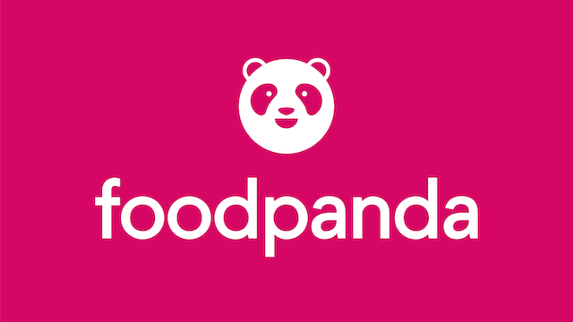
While the iconic panda is still part of the food delivery company’s logo, it has been tweaked to have a round face, while the brand colour has been changed from orange to pink with a slimmer more contemporary font.
According to the company, the new logo aims to be more memorable.
“Pink will be a strong differentiator for Foodpanda to stand out in markets in which orange is used extensively throughout the city,” says head of marketing Laura Kantor. Also, pink is the signature colour of its sister company Foodora.
The rebranding will roll out in 190 cities across 12 countries, including Hong Kong, Malaysia, Singapore, Taiwan, Thailand and the Philippines.
Along with the change in brand identity, Foodpanda has introduced an upgraded app and front end that introduces live tracking for orders.
While declining to reveal the cost of the rebrand, Kantor says it has been a “mammoth task” to convert all its brand assets. It had to work on its app, website and other digital platforms, before moving on to more than 1500 restaurant partners in Singapore alone to replace all its collateral.
Foodpanda also had to change out uniforms and delivery bags for its 3000-strong rider fleet, and also changed everything from orange to pink, including the walls, at its Singapore headquarters.
Meanwhile, the company is working with restaurants to create celebratory dishes that will be available exclusively on Foodpanda for two weeks.

