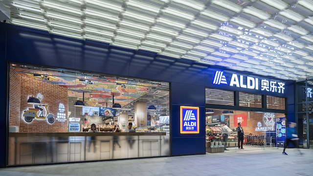
The first professional photos have emerged of Aldi China’s two pilot stores in Shanghai, which opened last week.

Designed by Australian-headquartered Landini Associates for Aldi China, the two stores are both about 336sqm in size. They feature a more upmarket look than Aldi’s European stores and are described by Landini as “an evolution of Landini Associates’ work for Aldi Australia, aimed at celebrating and conveying product quality and value”.

The stores represent a new trading format for Aldi Sud (South) and are the first of up to 100 planned for the city. Aldi has been testing the Chinese market online for about two years, selling its own-brand products on Alibaba’s Tmall to gain an understanding of consumer buying preferences and acceptance to hitherto unknown brands.
But as the photos show, the store is very obviously targeted not only at Chinese consumers, but the burgeoning expat community in the city – all signage is in English as well as Chinese.

Landini highlights key differences in the scale, layout and tone of the Aldi China stores, compared to the latest designs implemented in Australia.
“In line with Chinese consumer habits, where the preference is to visit multiple small shops per week, the stores are a much smaller format. The emphasis is on fresh produce and ready meals, with certain categories articulated for greater consistency, and key products placed at the entry of each aisle alongside messaging to appeal to and drive shoppers,” the company says.

“Key departments developed were snacks, produce, bakery, alcohol, imported goods, health, and beauty. The most noticeable difference for the Chinese market is the development of an on-site Food Station, as well as the addition of ready meals to take away or consume at the in-store dining kiosk.”
Low cost yet “real” materials were specified for the fitout, including locally sourced brick, terrazzo, an open concrete ceiling, warm timbers, and yellow accents which add to the perception of freshness throughout the stores.

LED lighting reduces glare and running costs while improving ambience and colour rendering, changing from day to night. Landini says the lighting was designed to create a pleasant atmosphere and let the products speak, enhancing colour, texture, and freshness. Energy-saving LED has also been incorporated in the fridges and wine displays.
Landini also designed an extensive series of messaging and graphic illustrations that are entirely unique to the Aldi China stores. More than 40 messaging boards were developed to communicate the brand ethos, product freshness, value, quality, and European and Australian products on sale.
There is no signage or ticketing displayed from the ceiling. Instead, category signage around the store perimeter offers greater visibility across the stores and thus encourage cross-store shopping. A vibrant, colourful mural on the ceiling above the service counter and checkouts is a playful hero graphics feature.
“Our two new stores are designed as pilot stores where retail approaches will be trialled and adjusted according to data and feedback from customers,” said an Aldi spokesperson. “This new store format has been customised and tailored specifically for the China market to better understand and interact with Chinese consumers.”
Ben Goss, design director at Landini, described the project as “a significant milestone for the brand”.
- Photography by Andrew Meredith.