Zara has been squeezed – and the only people who know why work for a design house in Paris.
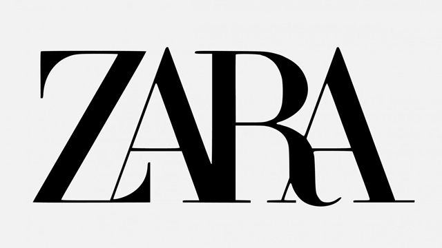
We are talking about the Zara logo, a new version of which has just been revealed by French design house Baron & Baron. In place of the simple and globally recognised block capitals ZARA, introduced eight years ago, is a new version in which all the letters are squished together, overlapping in what is best described as a confusing mess.
And I am not alone in my view. In the Court of Public Opinion – aka the internet – the “revamp” has drawn reactions ranging from blunt ridicule to basic dislike; it’s almost impossible to find a kind word online for the new design. The most common consensus is ‘why bother? If it isn’t broken, why fix it?’
According to Dezeen, the online design news resource, the new font resembles the signature typography of Baron & Baron’s founder Fabien Baron, who is also Zara’s artistic director, and which he used to overhaul the visual identity of magazine Harper’s Bazaar in the 1990s. No disrespect Fabien, but perhaps it would be best if you stuck to apparel design moving forward, because your taste in fonts is eccentric at best.
It is not just consumers and retail scribes like this one who are unimpressed with Zara’s “upgrade”. Fellow designers are not mincing their words either.
British designer Fabio Basile tweeted a prediction of what the next stage in the Zara logo lifecycle will probably look like:
“Seriously Zara, what the hell? You forgot the spaces,” tweeted Silvia Sgotti, adding the hastag “#failrebrand”
Besides the squeezing up of the letters, and the new exaggerated accents of the Z and R letters, some of the letters overlap. In short, it takes a little more than a glance to recognise the word, when surely the instant recognition of a brand should be the ultimate goal of a logo?
Quoted by Dezeen, German typographer Erik Spiekermann described it as “the worst piece of type [he’s] seen in years” in a Twitter post. He asked if it was designed by “one of those new robots that will replace humans”.
Among other designers and typographers to venture an opinion, one accurately referred to it as “claustrophobic”.
Baron & Baron designed the new logo with the intention of “lifting the retailer to the level of luxury contemporaries,” according to branding specialist publication Transform.
“But that aspiration is, realistically, unattainable by Zara,” wrote Keltie Mechalski, continuing on to quote Steve Blue, president and CEO at Miller Ingenuity: “When there’s a disconnect between how the market perceives a company and how the company perceives itself, the revised image rarely lands as intended.”
“Looking at the case of Zara, this may be what has occurred,” continues Mechalski. “Zara seems to have rebranded without fully understanding who their clientele are and, as a result, it has left consumers and [critics] alike dangling in between the notion of its aspirational self and reality.
“We have yet to see how this rebrand will affect their overall sales this year, but if the critiques of designers and industry professionals are any indication, they may have missed the mark.”


