A new year heralds a new colour palate, and with it the new retail design colours for 2019.
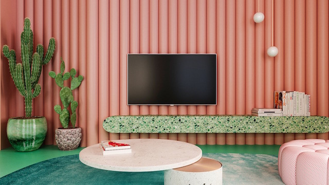
Last month, Pantone announced its choice for this year’s colour of the year: Living Coral, a bright cheerful pink with orangey hue, whose Pantone code is 16-1546. Pantone describes the colour as “vibrant, yet mellow” evoking warmth and nourishment “to provide comfort and buoyancy in our continually shifting environment”.

Due to the strong influence from social media on consumers, and a vast increase in digital technology, trends come and go and our daily environment is constantly changing. Living Coral is meant to remind us to step away from this environment by bringing in a familiar colour from nature to encourage more relaxed and upbeat experiences. In the world of retail design, we expect to see pops of colour in window displays, packaging, and furnishings within retail stores. Living coral will also pair nicely with other colours found in nature, such as vibrant greens and bright blues.
Complementary to Pantone’s colour of the year, PPG recently identified its colour of the year to be Night Watch. This black-infused green is meant to soften brighter colours with its neutral tone. Night Watch can also be used to make a bold statement as a featured colour in design. This colour is also meant to relax consumers and bring them into a more peaceful oasis away from the chaos of over stimulation by digital products and social media.

Sherwin-Williams announced Cavern Clay, an Earthy terracotta tone, as its colour of the year, Benjamin Moore chose Metropolitan, a soft grey, while Behr Paint decided on Blueprint, a vibrant teal. All of these colours can be easily paired with living coral to create uniquely bold statements in interior design.
As we enter into 2019, shoppers can expect to see these colours appear in stores across the world, from products that line the shelves, to window displays, to retail-store design itself.
The use of the bright living coral, paired with more neutral tones found in nature will surely bring the beauty of nature indoors creating an upbeat yet relaxing atmosphere allowing all of us to become more connected with the world around us.
- Samantha Chalmers is client manager – Shanghai at 5 Star Plus Retail Design.